Cart is empty
Add products to the cart — selected items, the total amount, and a quick checkout link will appear here.
Your cart
Menu
FUNPAY explainer video about game worlds and digital trading
FUNPAY LLC
14.08.2020
Explainer
24 days
The FUNPAY 2D explainer became an experimental project for me. Usually, I create promos with a darker and denser aesthetic. It feels closer to a gaming audience. Here, the task was different. I had to take a simple visual foundation. Then, turn it into a full promo, not a dry service explanation.
I wanted everything to work as one mechanism. So, I focused on fast animation and seamless transitions. Clean graphics supported the continuous movement. As a result, the simple idea opened up wider than expected.
The main goal was not to overload the video with details. So, I kept the black-and-white aesthetic, clean shapes, and clear rhythm. The transitions also stayed careful and calm.

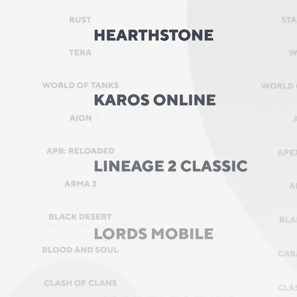
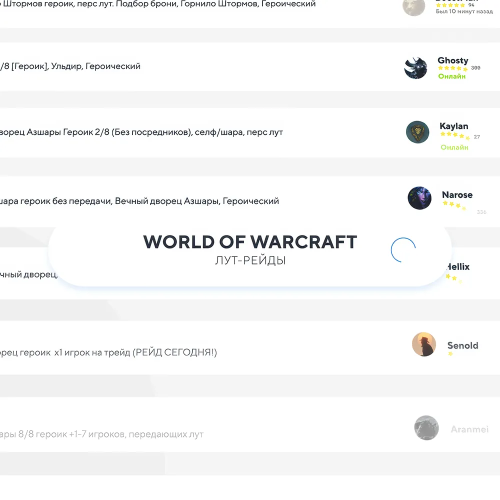
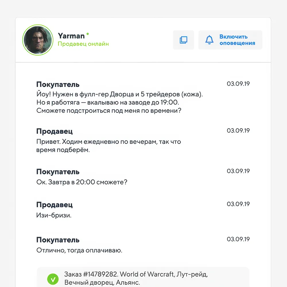

I took the platform’s minimalist visual language and turned it into a metaphor. The brand ellipses became orbital planets. It was important not to overload the video with details. Instead, I wanted to preserve clarity, rhythm, and readability.
As a result, it became a concise explainer in a black-and-white aesthetic. Through smooth animation, simple shapes, and careful transitions, the core idea of FUNPAY unfolds. The service feels clear, universal, and naturally built into gaming culture.
The palette here is extremely restrained — in fact, the video is built around just a few basic colors. And that was exactly the challenge: to make the image feel alive, beautiful, and expressive without the usual support of a rich color range.
I wanted to preserve the feeling of a clean interface, while moving away from a dry platform demonstration. That is why minimalism here works not as a limitation, but as a language: simple shapes, ellipses, orbits, and game worlds help tell the idea visually.
For 2020, I wanted to make the video not just “clear”, but also fairly fresh in terms of motion. That is why the main focus was on smooth transitions, careful dynamics, orbital movement, and animations that support the meaning rather than simply decorate the frame.